#6 JUNE: BRUTALLY GOOD
Let’s talk BRUTALISM. An evolution from the modernist movement, you might automatically think exposed concrete, hard angles, stark and cubistically minimal spaces like the iconic Barbican Centre in London, The Geisel Library in California or Boston City Hall. Not perhaps the architectural aesthetic that immediately makes you feel ‘homely’. But there’s a softer manifestation to brutalist design that’s been emerging in interiors, which embraces tactile textures, chunky silhouettes, mid century art, an abundance of green plants and colour to create a style that feels more playful, warm and welcoming. It’s all about the contrast, and I LOVE it!
So here’s my guide to creating a modern interior that is brutally good:
TACTILE TEXTURES - soften rough edges with tactile decorative objets, textural wall hangings, linen and boucle furnishings. Layer, layer, layer! Or bravely bring the brutalism in with abstract relief tiling on walls and furniture. Venture into the Parisian boutique Arrogant for inspiration; the French love child of the creative couple behind my favourite Ibizan hang-out, Los Enamorados.
CHUNKY SILHOUETTES - hunt out chubby shapes, geometrics and abstract forms. On a recent sourcing trip to Rye, I fell for the Arnold Circus Stool, a geometric stackable stool designed by Martino Gamper as part of the regeneration of the Shoreditch estate, available to buy here, perfect inside or out. And have a look at the brilliant curated collection of ceramics, art and vintage furniture at Rye gallery McCully & Crane.
MID CENTURY ART - whether an abstract oil painting on board, a modern geometric artwork or a colourful graphic film poster, there’s so much brilliant mid century art in circulation to bring that cool edge. Being half-Polish, I’m a big fan of the Polish School of Posters - you can find eye-catching Polish film posters from Projekt 26, who also host poster fairs throughout the year.
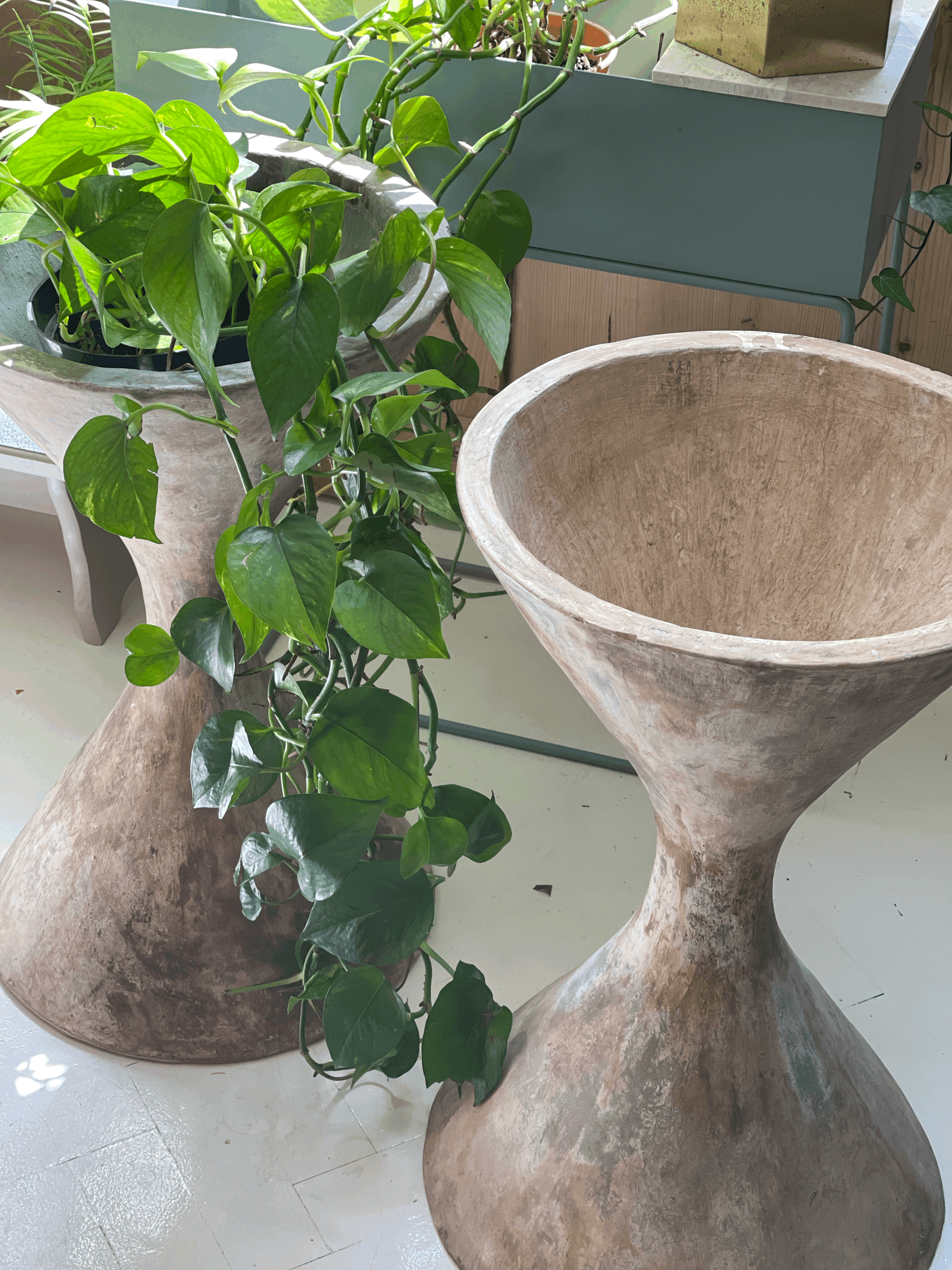
GREEN PLANTS - literally bringing a space alive, plants give a magical feel-good quality and I love to use greenery in every room I design. My crush though has to be the diabolo planters by Willy Guhl. The hour glass shape and composite concrete forms planted up with tropical varieties transports me immediately to Sao Paolo! There’s a beautiful pair with an insane patina in this month’s drop (see above); they’ll sell quickly so hit me up if you’d like me to source for you.
COLOUR - a warm palette of soft earthy pinks, oranges and yellows will lift a brutalist space or try a blend of clashing vibrant colours like burgundy, citrus and green to deliver the unexpected. In contrast, a neutral or monochrome palette will deliver the harder vibe so balance this with warm wood tones in your raw materials.
If you love this softer brutalist vibe but are unsure how to create it in your home, I offer remote design consultations starting from £50 for one hour - message me here and let’s get brutal!
With love,
Kim
X

